Icons are designed to help users navigate user interfaces. Nowhere are they more prevalent than on mobile dashboards. Dashboards contain multiple icons in a compact area.
If you’ve designed a mobile app before, you know how useful and prevalent icon buttons are. But what you don’t know is how often users mistap them when they're placed too close together.
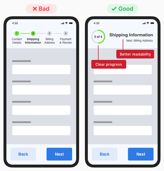
When your form has multiple pages, a stepper is a must. Steppers keep users informed about their progress by indicating what step they’re on and how many steps they have left.
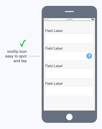
What interface element should you use to provide the user with helpful information about a form field? If you were thinking a tooltip, you are correct.
If an app is a product, then the walkthrough is its instruction manual. A walkthrough appears during onboarding—when new users open an app for the first time.
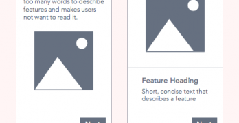
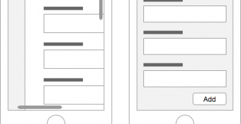
Figuring out your content layout is a tricky task on mobile devices. Desktop devices give you all the screen space to work with, but you have limited screen space on mobile devices.
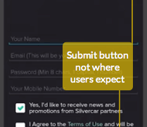
Where you place your mobile form buttons can affect task completion and efficiency. If they’re not in a place where users expect to find them, they could abandon their task and your form.
One of the most frustrating things users can experience on mobile sites is a modal window. On desktop, modals display without issue because of the large screen size.
A recent study found a quarter of all Americans use mobile devices to access the web. One out of every five people in the world own a smartphone and over half use it to surf the internet.
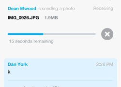
When users are on the go, the best mobile app experience is a fast one. Although the device's connection speed is out of your control, you can make your app appear like it loads lightning fast.
Designing graphics for mobile devices is a challenge compared to desktop devices. Designers need to understand the complexities of working with mobile technology.
Skeuomorphism is a fancy word for a visual design technique. But many designers misuse skeuomorphism when they use it for aesthetics instead of function.
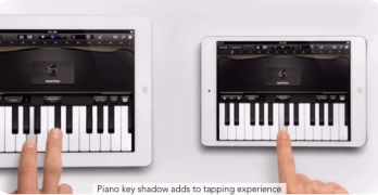
Tablet usage is exploding. One study estimates that "90 million americans will use a tablet device in 2014"[1]. With this statistic, understanding how to design tablet interfaces is more important than ever.
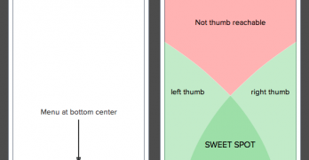
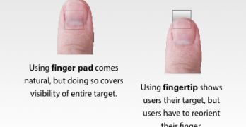
In darts, the bulls-eye is harder to hit than any other part of the dartboard. This is because the bullseye is the smallest target. The same principle also applies to touch targets on mobile devices.