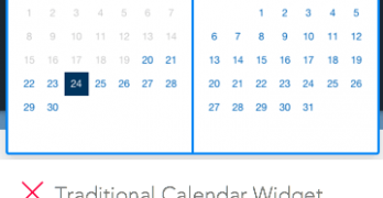
Booking an airline ticket is one of the most common online tasks. Every time users book a flight they have to use the calendar picker to pick a leave and return date.
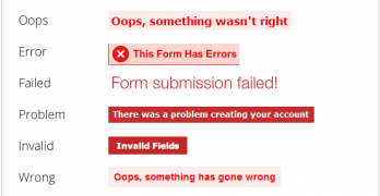
Filling out forms isn't always an easy task. No matter how simple you make it, users will make mistakes. Do your form error messages give users a feeling of worry or comfort?
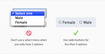
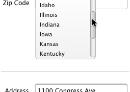
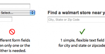
There are many controls to choose from when designing a form. Choosing the wrong one can make your form hard for users to fill out. One control that's often misused is the select menu.
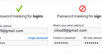
Masking passwords is a common age-old practice that's found on sign up and login forms. It's used to prevent over-the-shoulder snoopers from catching a glance of the user's password.
Signing up for a website is a big commitment to most people. Users who sign up for your site are giving you their personal information. If you misuse their personal information, you could abuse their trust.
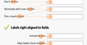
Label alignment on forms is a serious issue. How you place labels next to fields can affect how users fill out your form. There are only three ways you can align labels to fields.
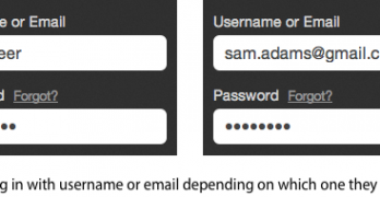
Forgetting your username is like forgetting your keys and getting locked out. It’s a frustrating experience, but a flexible username field can make it easier.
By now, most designers should know that top aligned labels allow users to fill out forms faster than left aligned labels. This makes sense when you understand the research.
Target recently redesigned their website. While many have their own opinions about it, there a few positive things designers can learn from Target's checkout form. At first glance it may not look like much, but once you dig deeper you'll find a diamond in the rough.
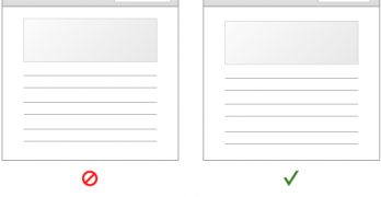
Filling out forms are painful when they're time-consuming. A form that's efficient to fill out can save users time. But it can also save companies a lot of money.
What happens when a website puts their login fields in the upper corner of the home page? Users can easily mistake the login fields for a site search box and get confused.
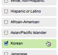
Checkboxes and radio buttons are an essential element of forms. But most of the time, they're not easy to click. This is because their click targets are small.
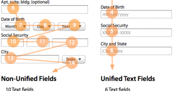
Nothing turns users off more than a long and complicated form. There are many ways designers can simplify their forms to make them faster and easier to fill out.
Users use forms to do many things. Finding a local store to shop at is one thing that should take them little time and effort to do. However, most store locator forms are hard to use and take up too much time.