All caps text is like a spice, you don’t want to overuse it. A little can go a long way when you use it on content and menu headings to contrast it from body text.
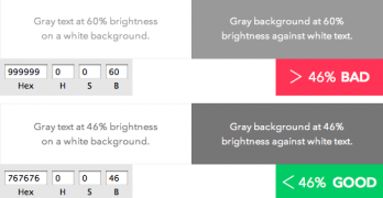
The color gray comes in many different shades. You can find them on different elements across most sites. Dark gray is often used for headings and body text.
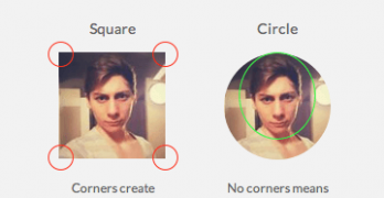
What shape are your app’s profile pictures? Chances are they’re square. A square isn’t the best shape to use because it makes it hard to visually process faces.
Did you know that the way your paragraph text wraps can affect how users read it? You could create orphans that hurt readability. Orphans are short lines that appear at the end of a paragraph.
Imagine walking into a small, crowded store. A shop clerk hassles you into buying something you don’t want. If this happened, you’d leave fast and look for another store.
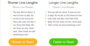
Have you ever spent too much time reading a web page? That might not have been caused by the amount of text. Research shows that margins and line lengths affect readability.
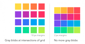
Imagine looking at a grid of images and gray ghostlike blobs appear on your screen. This isn’t a hallucination, it’s what users see when the hermann grid illusion takes effect.
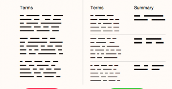
Have you ever read the terms of service agreement you agree to when you sign up for a website? A survey shows only 7% of users read the full terms when signing up.
Typefaces come in different forms. The most common forms seen on the web are regular, bold and italic. But there’s a trending typeface that designers should use on their user interfaces more often.
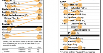
Nutrition labels have looked the same for decades. But the FDA plans to redesign them. By comparing the old and new, you can see why the new design is faster to scan and easier on the eyes.
Have you ever been to a website and couldn’t find what you were looking for? Most websites today overwhelm users with content irrelevant to what they’re looking for.
Almost everywhere you look on the web, you'll see sans-serif typefaces. They have long been the standard for on-screen text due to their increased readability on low screen resolutions.