Tap, tap, tap! Are users able to hit your mobile buttons with high touch accuracy, or are they missing their target? Before you blame the user, check the size and spacing of your buttons.
If they don’t have an optimal size and spacing, it’s no wonder users are missing their target or hitting the wrong button. If you’re not sure what’s optimal, this article will reveal the answer. The measurements below are in CSS pixels at 96 DPI.
Button Size Standard
It’s hard to know if your buttons are optimal without a standard to go by. Luckily, research on button size and spacing has discovered a standard that works for most users, including the elderly.

The study found that users had the lowest touch accuracy on buttons that were less than 42 pixels. Buttons that were over 72 pixels also had low accuracy.
The highest accuracy was found with buttons between 42-72 pixels. This means that 42 pixels is the minimum and 72 pixels is the maximum button size that’s most optimal for users.
The most preferred button size was 60 pixels, which is about the middle of the range. The 72 pixel button produced the highest touch accuracy and was preferred by older users.
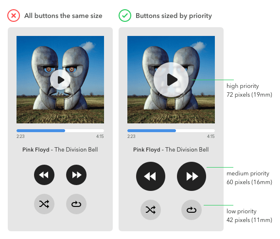
When using an array of buttons, it’s important to indicate priority. This way users know which actions will lead them to the most desired result. By following the button size standard, you can indicate priority in an effective way. No longer do you have to pick an arbitrary size and hope that it’s user-friendly.

The example demonstrates the use of the button size standard to indicate priority.
- High priority button = 72 pixels
- Medium priority button = 60 pixels
- Low priority button = 42 pixels
The buttons users use the most frequently are now easier to spot and tap. They’ll be able to tap it with a faster reaction time and higher accuracy. This is especially useful if the user’s attention is divided between different tasks.
Button Spacing Standard
When the buttons were too far apart, users moved to the touch target much slower. And when the buttons were too close together, users had the lowest touch accuracy.

The study concluded that a range of 12 to 48 pixels is the optimal button spacing. This wide range is useful because you can apply it to different button sizes. When you divide the wide range into smaller ranges, you get a button spacing standard that corresponds to the standard button sizes.
- 12-24 pixels for a large button
- 24-36 pixels for a medium button
- 36-48 pixels for a small button

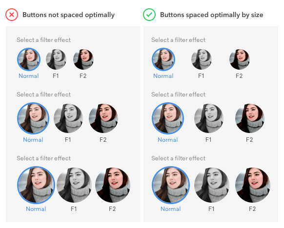
A larger button allows users to hit their target accurately even when their finger is slightly off target. But if they’re off target with a smaller button, they’ll miss and hit an adjacent button. This is why smaller buttons need more spacing than larger buttons.
The example shows how following the button spacing standard improves touch accuracy. The user’s finger can be slight off target and they’ll still be able to hit the button no matter what size it is.
Implications for Text Buttons
Can these standards apply to text buttons? These standards can apply to the height of text buttons, but the width will vary.
![]()
For example, a text button with the height of 60 pixels will have a larger width than a 60 pixel icon button, but it’s just as easy to tap. In fact, it’s easier to tap because the larger width requires less precision.
The button height is what matters more for accuracy. You can see that the touch accuracy of text buttons remain consistent with icon buttons.
The button spacing standard doesn’t apply to text buttons due to the larger widths. But a spacing of at least 12 pixels is good to have for visual separation.
Sizing Up Your Buttons
Do your buttons have an optimal size and spacing? Following the button size and spacing standards will guarantee that your mobile interface has high touch accuracy.
Going by your feelings to decide on proper size and spacing leaves room for uncertainty. It’s better to establish an optimal standard you can rely on. This is how design systems are formed and why many companies use them.
Think about what standards you and your company follow. If you don’t have any, establish some and you’ll be able to scale a great user experience across platforms.


The Audible app could use this.
Yeah i would take this with a grain of salt… This study was done with subjects between 50-85 years of age…. Hardly your main user group.
Disregarding the insight based on a demographic detail would be unwise. Older users are not a different species. They have fingers and use them the same way like younger users. The only difference is that they prefer larger targets.
In the study, they most preferred the 72 pixel button. If you have a younger user group, 42 and 60 pixel buttons are sufficient.
Also there are people who use certain mobile applications for performing their tasks while they are on job and they have to wear gloves on field. Even they would need a target which is easily tappable.
First, if one is designing a separate button with no adjacent buttons, and a reaction time of around 1400 ms is acceptable, then an acceptable minimum button size is 11.43 mm square. A larger button size, such as19.05 mm square, should be used if the task requires better performance. explained…
I wish Instagram’s designers would take this to heart. I am constantly tapping the wrong button, because the like and comment icon buttons are too close together for their size, for no reason as there is plenty of horizontal real estate to add space.
Hi, I’m working at UserHabit which operates mobile app analytics solution as an UX Designer.
We’re also publishing good UX articles with translation under the permission of writers in our blog.(Link ▶︎ https://brunch.co.kr/magazine/analytics-trans) I love your writing and topics, so may I translate this article into Korean to spread good articles worldwide? Please let me know your answer to this suggestion. Thank you for the good article 🙂
Sure, just be sure to provide a descriptive link that credits UX Movement as the original source.
Hello, great article! I’m a UI designer in China, I learn a lot about optimal size and spacing for mobile buttons from your article, thanks for sharing. Can I translate this article into Chinese and share with my friends?
I’ll attach the original author and the link, look forward to your reply
Thank you!
Speaking as someone who focuses on digital accessibility – I love this article!
Thanks for your useful article.
By the way, how to convert these size to dp, or others measure units?
Hello, amazing article, i would like to ask something more although, are those guides applicable also on tablets? I’m trying to find information for optimal tablet button sizes and i can’t find anything. Should we use the same dimensions for mobile buttons and tablet buttons?
Thanks
Yes
Hello,
I see the based study for this article is from 2007 – do we know if those recommandations still apply in 2021? Is there any update regarding screen resolution evolution?