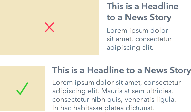
Are your images distracting users from reading your headlines? Eyetracking research done on news sites found that most view headlines before images. If your images are too large, users could have trouble reading your headlines.
Headlines attract users first because it gives them relevant context to an article. An image by itself has no specific context and is not relevant to the user. The headline tells users how to interpret the article image for relevance.
Headlines Should Dominate Images
Users are searching for useful information when they’re on a news site. Headlines need to dominate more than images so that users can gather relevant information quicker when they scan. An image that dominates the headline distracts them from this task.
There are a few ways to make your headlines more dominant. Below are some ways to do it in a horizontal layout. You can make your headlines the first thing users see by placing them at the top and aligning them to the left. The image would go below it alongside the teaser text. This makes it easier for users fixate on the headline first.

You can also make the headline more dominant by making the image a smaller width. If your images are wider than your headlines, they’ll compete for attention and distract users. Instead, let your headlines win with more width.

Users want the context of a news article first before they invest time into reading it. Give this to them by making your headlines more dominant. Design is about emphasizing what’s higher priority on a page. What’s high priority is what users pay attention to first.

