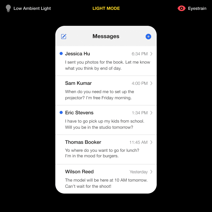
Nearly 70% of Americans suffer from digital eyestrain (source). The average American spends over 7 hours per day looking at a screen (source). It’s no wonder why eyestrain is such a common problem.
Cutting back screen time can reduce eyestrain, but there might be a way designers and developers can help mitigate this problem. Dark color schemes for interfaces could improve the user’s viewing experience.
Low Ambient Light
Most interfaces default to a light mode that displays dark text on a light background. While light mode is beneficial for text contrast and legibility, the brightness of the light background can strain the eyes under certain conditions.

If you’re in a place with low ambient light, a light background will cause the pupils to work harder to adjust to rapid light changes. The pupils will dilate when there’s less light and constrict when there’s more light. This constant dilation and constriction tire the eye muscles, leading to eyestrain.
The degree of dilation is determined by the amount of light hitting the entire visual field, not just a single point or area. That means any darkness surrounding a light background will bleed into the visual field and affect the pupil. Focusing on the screen alone without looking anywhere else would not prevent eyestrain.
Research shows that reducing the contrast between the perceived brightness of a screen and ambient light reduces eyestrain (source). A dark mode background would cause the pupils to constrict less and stay dilated. As a result, users can focus better without experiencing visual fatigue.

Subscribe to read the full article
Subscribe to UX Movement newsletter to learn more about how dark mode affects the eyes. By subscribing, you’ll get exclusive access to all our premium articles.

