Your interface likely uses an accent color to highlight interactive elements. It’s usually your brand color or another color you’ve designated. When you use the same accent color on multiple elements, they compete with each other. You should avoid doing this because it scatters the user’s attention and lowers their efficiency.
Different interactive elements that share the same accent color can cause confusion. Users need to be able to differentiate between different controls based on priority and function. When they see your accent color everywhere, it becomes noise instead of the signal they need for interaction.
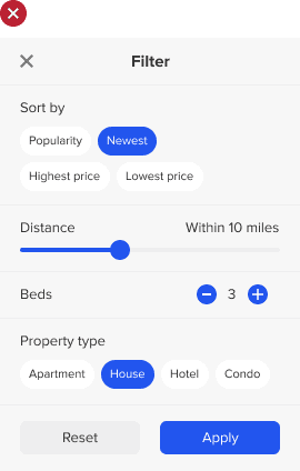
The example below uses a blue accent for interactive elements. Since they’re all competing with each other, the primary element (call-to-action button) is drowned out by the noise. As a result, users will find it more difficult to complete their tasks. Not only that, but all that blue noise makes the screen look overwhelming. It requires more cognitive effort to process each interface component.
Access Full Article
Access the full article to learn how to choose colors for your elements that will raise user efficiency. Your subscription gets you full access to this article and all future articles.
Book

Affiliate

Aren’t you guilty of doing the same thing on this site? “Access full article”, “Subscribe”, “Post comment” and the Search icon are all the same accent color.
Those are all action buttons. They aren’t different interactive components. Seems like you didn’t comprehend the article my friend.
“Different interactive elements that share the same accent color can cause confusion. Users need to be able to differentiate between different controls based on priority and function.”
Okay fair enough 🙂