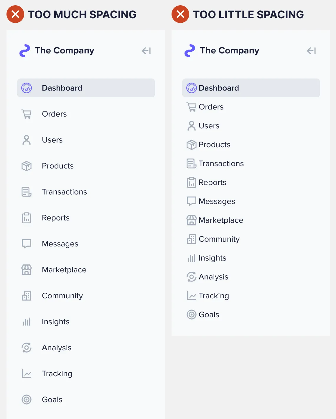
Navigation How to Make Any Sidebar Menu Easier to ScanMarch 19, 20250 Comments How easy to scan is your sidebar menu? If you haven't optimized the spacing, users…
Navigation The Optimal Design for Sidebar IndicatorsNovember 22, 20240 Comments A sidebar navigation on an interface offers users multiple items to select. After making a…
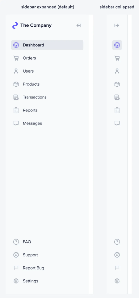
Navigation How to Design a Sidebar That Saves Screen SpaceNovember 22, 20240 Comments Screen space on a desktop interface is more important than you think. Most designers take…
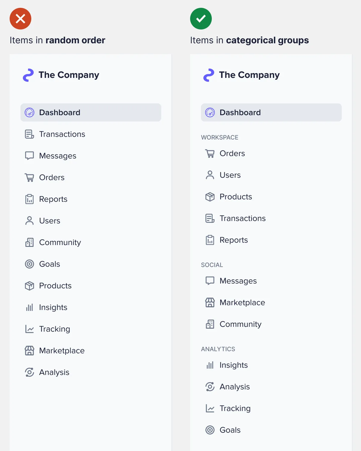
Navigation How to Handle Large-Scale Item Groups in a SidebarAugust 27, 20240 Comments A sidebar navigation with a few items is simple to design. All you have to…
Navigation A Better Approach to Multi-Level Sidebar NavigationAugust 26, 20240 Comments Designers must stop using multi-level sidebar navigation. Grouping many items and subitems together in a…
Navigation The Best Location for Navigation Items on Web AppsAugust 19, 20240 Comments There's a reason most websites use a top navigation bar. On a website, content is…
Navigation How to Design a Smart Search Bar ExperienceJune 20, 20240 Comments Website search bars have a serious problem. Research has found that 69% of users go…
Navigation Why Users View Details Better with Compact SlideoversJanuary 8, 20240 Comments The conventional approach to displaying details is no longer the best option. When users click…
Navigation Why “View More” Buttons Are Better Than Pagination LinksDecember 20, 20230 Comments How easy is it for users to browse your page content? If you're using pagination…
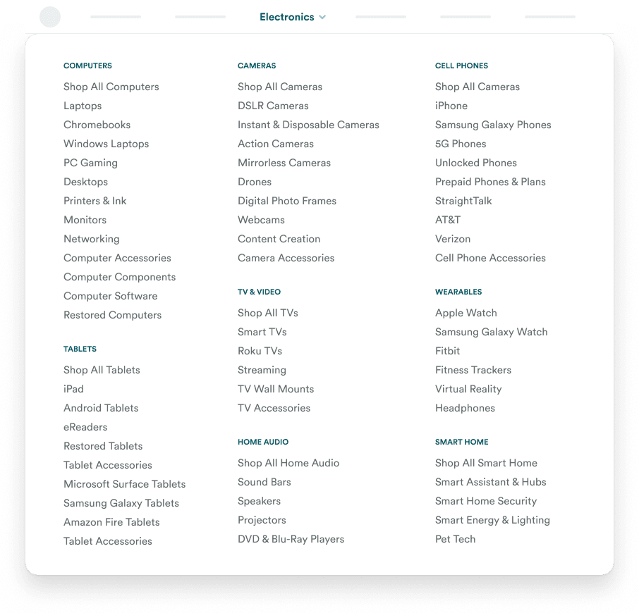
Navigation How to Simplify a Confusing 65 Item Mega MenuAugust 17, 20230 Comments How would you design a menu for a complex website with many categories and subcategories?…
Navigation How to Design an Intuitive Category CarouselMay 18, 20230 Comments Carousels are not just for displaying homepage banners. They are versatile components that can showcase…
Navigation The Myth of Low Engagement CarouselsMay 12, 20230 Comments There's a myth that carousels have poor user engagement and should never be used. However,…
Navigation Why Hover Menus Should Always Touch the Navigation BarDecember 13, 20220 Comments One of the most frustrating user experiences is not being able to click a menu…
Navigation When You Should Use a Sticky Navigation BarDecember 2, 20220 Comments The navigation bar of an interface is a special place. It’s where users go whenever…