Buttons How to Convert Your Light UI Colors into Dark ModeAugust 2, 20230 Comments Does your interface have a dark mode? If not, you're missing your chance to give…
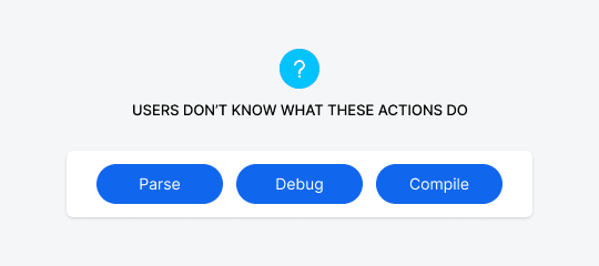
Buttons How to Make Technical Button Actions More PredictableJuly 24, 20230 Comments Suppose you have a button on your interface that users don’t understand. When they see…
Buttons The Cleanest Zero-Clutter Page Layout for Shopping CartsSeptember 30, 20220 Comments If you've ever bought anything online, you're probably familiar with how cluttered shopping cart pages…
Buttons How to Fix Apple’s Illegible White Button LabelsJune 20, 20220 Comments You may not have noticed this, but many apps and websites use white text labels…
Buttons The 16 Universal Icons to Use on All InterfacesFebruary 15, 20220 Comments Icons regularly used across different apps and websites are easier to interpret and more recognizable.…
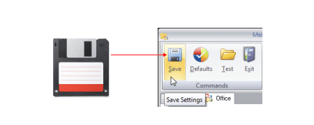
Buttons Why the Floppy Disk Icon for “Save” Must DieFebruary 10, 20226 Comments Floppy disks are a thing of the past. People used them to store digital data,…
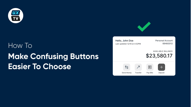
Buttons How to Make Confusing Buttons Easier to ChooseDecember 21, 20210 Comments Buttons that are similar and confusing will trip you up and slow you down. How…
Buttons How to Make Similar Button Choices Less ConfusingDecember 16, 20210 Comments When choosing between several buttons, users have to read the labels and think about each…
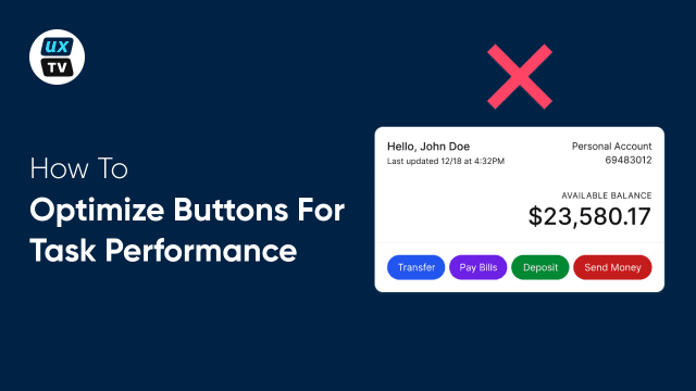
Buttons How to Optimize Buttons for Task PerformanceDecember 10, 20210 Comments It wasn’t easy, but I finally made my first UX video. It’s about optimizing your…
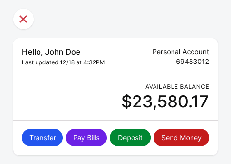
Buttons Optimize the Color of Grouped Buttons for Task PerformanceDecember 2, 20210 Comments Does your interface have grouped buttons that users have to choose from to do a…
Buttons The Most Accessible Button Color for Colorblind UsersOctober 26, 20210 Comments What constitutes an accessible button? For one, it has to have high color contrast for…
Buttons Why You Shouldn’t Use Your Brand Color on ButtonsOctober 22, 20212 Comments Many apps use their brand color on their call-to-action buttons. Doing this may seem like…
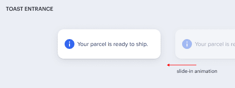
Buttons Why You Should Use Toasts to Express Interface StatesJune 29, 20210 Comments Imagine performing a task on an interface and not getting feedback on whether you're doing…
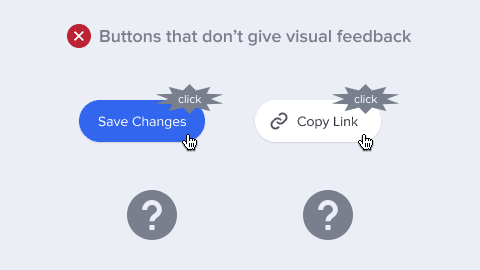
Buttons How to Give Visual Feedback After Users Click a ButtonJune 22, 20210 Comments In physics, every action has a reaction. This law applies to interface design too. When…