Figuring out your content layout is a tricky task on mobile devices. Desktop devices give you all the screen space to work with, but you have limited screen space on mobile devices. Users can only view a small amount of content at a time before they need to scroll.
This challenge makes you wonder what the most efficient layout for viewing is. Should you use a list view or grid view? Your decision could affect how quick and easy it is for users to find what they’re looking for.
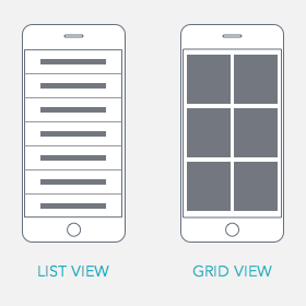
List vs. Grid View
List view presents your content in a single column list. It’s text heavy, and there are no images. At most, you can display icons or thumbnails next to the text. Users rely on reading the information to make their selection.
Grid view displays your content in two or more columns with images. The images dominate most of the space, and text is shortened to prevent too much text wrapping. Users rely on the pictures to make their selection.
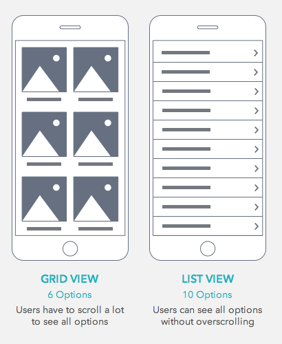
List View Prevents Overscrolling
Many designers use grid view because it’s more appealing to the eye. But the problem is that grid view forces users to scroll more. Grid view includes images which make the page much longer. It’ll take users many scrolls to view all the available options. This layout put too much work on their fingers.
List view prevents overscrolling by making pages shorter. The exclusion of images allows you to fit more options per screen. It also allows you to use accordions to add layers of suboptions on the same screen. Users find what they’re looking for by scanning text labels.
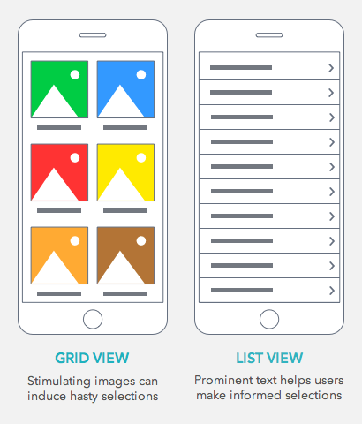
List View Prevents Hasty Selections
Not only does grid view force users to scroll more, but it causes them to make hasty selections. Users get so stimulated by images that they’ll select the first option that appeals to them.
This hastiness often gets them lost in a section that doesn’t have what they’re looking for. The user then has to go back and scroll further. With so many stimulating images, it’s easy for users to get distracted and misled.
List view prevents users from making hasty selections. The text provides precise enough information to help them find the content they want. They’re able to make the best selection after reading through all the options.
If your list view seems too text heavy, you can always add icons or thumbnails to give it more visual interest. This balanced approach is better than grid view because it doesn’t overstimulate users or overshadow the text.
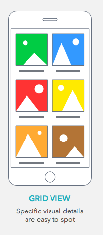
Grid View Works Best for Examining Details
Aside from aesthetic appeal, grid view also helps users when they’re examining details. For example, if a user is shopping for a shirt, they’ll have a specific type in mind. It’s only after the user has narrowed down the content to a category that grid view is most effective.
A grid view display of clothes will distract more than help because only a few of those images will be of shirts. The user has to scroll to filter out a lot of irrelevant images when scanning.
But once the user is in the category of shirts they want, the images will have more relevancy. The user can scan the shirts and spot specific details they’re looking for with ease.
More Content with Less Work
Most users don’t have much time on their hands and need to be able to find the content they want fast. The layout you choose is critical in making this happen.
There’s more flexibility with layouts on desktop, but on mobile, your choice matters. The view that allows users to consume more content while doing less work is the winner.
Book

Affiliate

Or just do what most apps do like Ebay and offer a button to switch between grid or list, best of both worlds.
Anthony, I enjoyed your article. Too often these catalog style pages are points where the user gets lost and bails out. As designers, we’ve failed to understand their needs at that moment in the experience. For me, the choice to use grid or list depends on the decision you want your user to make next. Do they need an image at this point to get them to make a tap?
A well-executed example is the activity playlists in the Apple Music app. As a user, I’m selecting music based on my mood. The list view uses a background image and a simple headline that makes it easy to connect my mood with a choice on the screen. A simple text list is not enough for me to make an emotional connection, but adding the image I can quickly make a choice.
Exactly, context is everything, as are the characteristics of your users. If designing an app for folks with developmental disabilities, they need to have large images and a grid to easily make selections, not text and tiny icons.
For me,it’s depend on content on website. Gird view is the best for online shopping that user tend to view products. However,if user gonna go other categories. List view may be choice for categories list because it doesn’t need big image for categories list. Just small but clear and some text is enough for user to know what that category is.