When you see a ‘Submit’ button on a form, what comes to your mind? One could reason that clicking the button submits the user’s information into the system for processing. A ‘Submit’ button describes what the system does well, but it doesn’t describe what the user does at all.
When users fill out a form, they’re doing a task. The action button should affirm what that task is so users know exactly what happens when they click that button. The more clear your form is, the more you’ll get users to complete it.
A form button that says ‘Submit’ gives users the impression that the form isn’t focused on completing a specific task. It also gives the impression that your website isn’t user-friendly because you’re speaking in a technical way most users aren’t familiar with. If this is the impression they get, you can bet you’re going to lose a few users.
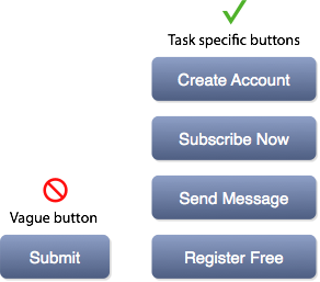
Your form button should describe exactly what the user is doing in their task. For example, if they’re signing up for an account, a button that says ‘Create Account’ tells users that clicking the action button creates an account. It’s clear and specific to their task.
If the button had said ‘Submit’, users would question what happens when they click the form button. Avoid making them uncertain by using a button label that describes the result of the user’s task.
‘Submit’ buttons still exist on forms today. The good thing is that fixing them is simple. It requires nothing more than labeling your buttons with a task-specific action. It might not seem like a huge difference at first, but when more users are completing your form, you’ll know that they respond best to task-specific buttons.
Book

Affiliate

Thanks for the insight! Will be changing my button text ASAP.
Ironically, your comment system does follow your suggestion by calling its submit button “Leave comment”, but that phrasing is ambiguous and might let the user to think that if they press it, they will abandon their comment 🙂
Actually, something I observed on a site I design is that, many people click the “leave comment” button without filling a comment; they ignore the text area, and assuming leaving a comment is another process, they click “leave comment” to start -leaving a comment- process. It can be an expected behavior since, take “register” button as example, users are also used to buttons that start a process after they are clicked. Therefore, I sometimes use “submit” as well.
I think what really matters is, having a prominent and visible next step button, and it is ok if it is vaguely labeled. People act with affordances, and if the expected behavior in a form is to submitting it, then they will click whether you call it “submit” or something else (of course, not something confusing).
I would like to see if there is any a/b testing or user testing showing users getting confused by “submit”. Without data, I wouldn’t be obsessed with this.
This is the reason that A/B testing can be so invaluable: it tells you, without question, what works better. Now, why don’t I do it more? 🙂
But how do you do A/B testing for this? If you do it on your site with some users seeing one button while others seeing the other, how do you measure which is more effective? Unless you are conducting a controlled test in a lab with a moderator, you won’t know — is that the kind of test you mean? Moderated A/B testing in a room?
I agree. I will do may part moving forward.
I agree what your saying in principal but what about if your more descriptive with something along the lines of: ‘Submit your details’ on the form submit button?
As you mention above – a form button should describe exactly what the user is try ing to do in their task.
So if on a form I am Submitting my details, surely this is plausible?
A button that says “Submit your details” is still not task specific. It’s still vague because that action can apply to various contexts. Your button label should specifically apply to the context of your task.
The question you should ask yourself is why the user is submitting their details. What are they trying to do?
Agreed. Things like “Sign up now” or “Join our group” all mean “submit your details” but provide a more personal, detailed explanation to the user.
But, why are you asking the person to “Submit my details”?
Is it to “Create New Account”? Is it to “Update My Account”? Is it to “Continue with Registration? Or, better yet, “Continue with Registration Page 2 of 4”?
Your button should let the person know what happens (or, what should happen) when clicking it. Not only is it more personal, it lets the person know if something goes wrong if it does not happen.
I find that with Enterprise Software the need for generic buttons doesn’t lend itself to have a unique task-related button for each form. I prefer the button text in a form or edit to be “Save”. That’s what the user and the system is actually doing. Submit is what the html form is doing.
The other piece that isn’t mentioned here is that “Submit” is a very domineering term. There’s a subconscious command every time you are told to “submit” to the needs/demands of the organization. This is not user-centric form design, and can be a further turn-off. Other commands with more “comfortable” terminology – such as “free,” “gift,” “help now,” etc. – are better accepted by the user’s subconscious.
It’s not mentioned because due to context nobody actually takes it that way. Nobody sees a Submit button and has a subconscious reaction that they’re being dominated. 😉
You can “break” something (your nose, your femur), but when someone says “let’s break for lunch” I don’t subconsciously drift towards thoughts of pain.
How about the translation memory when you localize the form in another language. David Sedaris is the only person to say things like “Me talk pretty one day.”
Things like PTSD can create responses in people that you would not normally expect. So, I am glad you are able to speak for every one of your users. I would prefer to speak to more users than I could possibly know.
Of course, I meant to say, “David Dearis in not the only person….”
I’ve always said the same thing!
definitely agree with this…”submit” is a command term even if the context is “turn in your form for help.”
changing the “submit” mindset is challenging in my experience. maybe it’s just the co. i worked for… but i do prefer a better active term for the user experience.
This is real. I’ll consider this suggestion for future projects. Thanks for the insight.
Hmmn very interesting never looked at it that way. My call to action skill sets are for noobs. I’m very lucky to be here. brilliant post.
Also of note – the longer the text label, the larger the click area (Fitts’ Law).
Compare: “Submit” vs (e.g.) “Send this message”
Having more specific button text can also be used as a call to action to get users to sign-up or purchase.
it might be good for some to only have the “submit” text on the buttons, people that are used to the internet commonly know what the want, and since they are used to it some will think the submit button is not friendly to the users, people that are new to the internet are the ones that tend to expend some money on the internet and for those people submit is the most accurate word for a button in a form.
I’m interested Cristopher, on what research you base your insight on?
Same here.
As a user, I hate Submit buttons that have labels that imply to me that they’re going to begin the process that I think I’m almost finished.
For example, Create Account is a great name/label for a link that takes you to the page/form for account creation. Websites do, in practice, use that name for that link. So it’s weird to use the same label for the submission of the form, and as a user when I see it I get a negative emotional reaction, involving confusion and a desire to just stop dealing with this.
Perhaps “Submit Account Creation Details”? Kinda wordy. Although as a previous commenter noted, longer labels (for important verbs) mean easier ergonomics.
I agree with Jeremy. I get a bad feeling that I am going to loose all I entered in the last 20 minutes and loop back to the blank starting form if a submit button says something like…Submit and Sign Up. Usually I associate this wording with the start of a process. Submit works just fine since it has been around for years and people have grown accustom to it’s purpose.
Wow, people really didn’t think about this before? It’s just the decades-old “use a task-specific verb rather than “OK” in dialog boxes” guideline, which any designer should be familiar with, rehashed for the web.
Very good point.
Wanna use your article on my blog by translating it in french if authorized.
But, be careful.
Submit is at least familiar to the user, because it is so widely used and has been for years.
On the other hand, some of the buttons that try to be more specific can lead to confusion. Does “Register free” take me away from the current form to a free registration page or does it complete the registration process?
I see a lot of confusing submit buttons around the web that would not be confusing if they were labeled Submit.
Exactly! I was just saying this high up. People tend to get confused when you deviate from this common practice.
Wow cool thought, but brilliant logic!
Has this (as an earlier reader mentioned) been A/B tested? I like your suggestion anyhow (I think “Request a Trial” is a LOT better than “Submit” for a request trial page!) but the skeptic in me feels that this is a bit of semantic quibbling that isn’t actually all that important. Most people understand and are fine with “Submit” as an action since we use it for all kinds of things… submitting our insurance claims, submitting our census forms.
It IS a semantically correct name for what you’re doing, in addition to (but independently of) being the technical term used by HTML and the default label. It was chosen for technical reasons BECAUSE it is the plain-english semantically-correct term as well.
So true. Good tip. Thanks.
” you’re speaking in a technical way that most users aren’t familiar with”
Considering “Submit” has been the de-facto value of the *ahem* “submit” button, I don’t think the meaning goes over anyone’s head.
“you can bet that you’re losing a few users in the process”
I’d also like to see some usability tests, or other stats, before I can accept that to be true. Not saying I don’t agree in principle, but I honestly don’t think it makes much, or ANY, of a difference.
when i first saw this header on hackernews i laughed out loud. the first thing that came to mind was changing all buttons to “Submit…Never!” but i guess that’s what you get for being an anarchist. frankly, i don’t get i though… we’ve been ‘submitting’ forms since we were kids, and unless it’s a cultural or language thing i frankly don’t see a problem with the word. it’s about as friendly as ‘landlord’ but that’s no reason to campaign against its use… personally, i think most people would be happy with a simple “Ok”. Windows has been using it for millennia.
Great article!
As a front-end web developer and web designer I feel that the little user friendly details are key to success. On my personal site’s contact form I labeled the button “Send Message” rather then submit, this has proven more helpful to the average user, and I’ve even had some mention that!
I’m glad to hear that your users have actually told you that Send Message works better than Submit!
Totally agree. Thanks for sharing.
Never actually thought about this. Will be changing all our form buttons.
Interesting, I hadn’t thought of it that way. Was more focused on making the button smaller. Thanks for the insight, will definitely keep it in mind.
I agree with having task specific buttons but sometimes “Submit” seems perfectly appropriate. For example, if you have a form to create an expense report and you need a button that means “save and then route the expense report for approval to the appropriate person”, which can differ based on rules like whether the expense report exceeds some thresholds, then “Submit” works well.
“Send Expense Report” would probably work better.
Yes, I’d go along with ‘submit’ for that particular case, but only because “submitting your expenses” is the real-world term for it, and the real world process *also* has connotations of sending your form into some nebulous void you aren’t expected to understand. Which is usually the thing we want to avoid with good UX design…
Great post.
It’s as if the idea of a ‘submit’ button was designed by a someone involved in server side programming and it was never re-looked by for the client side design.
Labeling a button with a more specific command also helps to guide a user through a sign up procedure as one of the principles of a great user experience is based on storytelling
What about software “forms” (such as dialog boxes with OK/Cancel/ buttons)? Do you think this same principle hold true there? Should software developers use task-specific text instead of the omnipresent OK when designing software forms? A part of me says there’s something to be said for consistency in look and feel with just sticking with OK/Cancel/Default buttons in that situation.
This is a good question. For dialog boxes, Cancel buttons are perfectly fine. But OK buttons are not OK. They are just as vague as Submit. I will explain why in the next article.
Yeah, that’ll be a good one. If OK is something more specific like “Save game” or “Upload x”, it can really help esp if the question/dialogue was poorly worded.
You’ve made the huge assumption that users will even read and consider what they are clicking on before they submit their data.
Here’s the info : Most of them won’t.
So that’s where in the majority of cases your overblown logic falls down.
Keep using your technique if you like but it offers very little in the way of value for user experience for likely 99% of your users.
Also,just so you know : The most user friendly forms submit themselves through ajax. No button required.
I certainly hope you don’t live by that philosophy. I DO NOT WANT A FORM TO SUBMIT ITSELF – EVER. No user should. Period.
A form that submits itself is a form that assumes it knows when the user is finished.
A form that updates itself via AJAX when the user selects something is a good thing. But no form should actually submit itself.
I am so sick of idiots ripping others as if they have UX muscles. First off, understand your practice. – you dont know my users, i dont know your users. Second, I would never hire someone who claims facts like that and acts like it is true.
Great points. I don’t know that I’d say it should “never” say submit, but at least 99% of the time something more specific is better.
nice point!
i guess everybody should stop being lazy and label the buttons.
This is a great post. I do believe it gives that confirmation of what exactly the person is going to do before clicking the button. As mentioned, this is so the person doesn’t question or second guess what they’re submitting.
Something to definitely keep in mind. Thanks!
Be easy, be human, be real.
Even if your target is pretty smart you should design everything ” dumb-ass proof”.
The people will enjoy a easy place to navigate and whats prove that is a better conversion rate.
What if the form is doing all 4 – creating an account, subscribing to some lists, sending out msg and registering for some free mailers? It actually depends how a form is designed.
What does it look like the button does for the user? “Create Subscription Account” is probably all they need to know.
Thanks for sharing the common sense guideline for button design. This definitely helps.
Buttons should always be labeled with actions; this was an explicit guideline developed during the creation of the Lisa and Macintosh human interfaces, partly in response to this situation:
http://www.folklore.org/StoryView.py?project=Macintosh&story=Do_It.txt
In many situations “OK” was not only too colloquial, it didn’t give users enough guidance on what would happen when they pressed the button. Labeling action buttons with a verb (including “Cancel”) ensures the result of an action is clear.
Good suggestion. Thank you.
Lets not forget to remove the “reset” button. No form should have a reset or a clear.
I agree but, if you have well labeled your form’s fields it could’t be necesary. Isn’t it?
🙂 I will tell my designer and I will also follow this.
thanks
Being specific avoids confusion. It also has one more benefit – emotion. Our mind feels better to click on “Give Me the Free eBook” than “submit.” Our mind is action-oriented, and when I click on “Send Me Money Secrets”, it immediately generates the a mental picture of how my life is going to get better by clicking on the submit button. Great post. I am sharing it on my Twitter.
If you localised your software to other languages than English, “Submit” is a bit tricky. When translated, it might just remain vague, or more likely it will be translated in a more specific way, usually “Send” “Save” or similar. That more specific translation might be the one you meant (and should have used in the first place) or it might be something else.
Just saw this “tweeted”, very interesting and shall be renaming any Submit buttons that I have and for my client websites. Submit is very vague indeed.
Good advice. Cheers.
Very interesting article and debate. Normally I would extend the caption to “Submit your details”, but I do like the idea of making this more relevant to the user.
Thanks for sharing the article.
While I agree that a more descriptive label is better – I completely disagree that “Submit” is something that users aren’t familiar with. That is like saying users aren’t familiar with a mouse – its been a standard for so long that everyone understands it and how to use it, unless they have 0 experience with a computer.
Thanks for this post – it got me thinking about the use of ‘Submit’ in forms that I create, and to think in future whether there is something more descriptive for a specific form task I can use – a helpful article and something many people might well gain from if they heed the suggestions here.
The ‘Submit’ label is in context of the legend value of the form.
If we were to look at this form currently, it states:
Legend: ‘Leave a Reply’
Submit: ‘Leave a comment’
This doesn’t flow well for me. Is it a reply or a comment? Both? If we were to go with either for legend, ‘Submit’ label for the submit action would do fine. Since you are submitting a reply or a comment.
A part of good UX is to implement widely used practices so that users deal with what they are familiar with instead of trying to figure out something new. Hence, the ‘Submit’ label fits the bill just fine.
So context + conventions sets it up. Labels can sometimes be implicit and that’s fine. There are always exceptions.
Having said that, the article still raises a good point about usability. I would say that the key is to find a balance between legend and submit labels of the form.
Sarven, have you ever done any user testing, just because a practice is widely used, doesn’t mean it will give you the best results.
Try some simple split A/B testing you might be surprised that your assumptions are not necessarily correct.
@Think Professionally (do you have a real name?),
I don’t think we need to debate about whether actual test results is better than no test results, because that’s a no brainer. What I’ve stated was a simple observation. Given no test results, it is safer to stick to widely used practices.
If there is a proper legend/heading for a form, ‘Submit’ is good enough. It is a rough guideline to stick to, and certainly not a must. The ideal solution in my opinion would be to pick the best text combination. Otherwise, you’d end up with something redundant and nearly confusing like this form: “Leave a Reply” and “Leave comment”.
Keep in mind that not every site/community have the chance or resources to do any sort of test for their visitors, analyze the results, and integrate the improvements.
In any case, it sounds like you might have done or come across test results that contradicts the things that I’ve mentioned for the majority of the users. I’d be happy to look at them if you don’t mind sharing them with us.
Sarven, you are entitled to your opinion, but I disagree with you. Submit is not what you call a “widely used BEST practice.” It’s a widely used BAD practice. Just because it was widely used in the past does not make it a best practice. A best practice is an approach that is effective for users under most circumstances. A Submit button is not effective for users under most circumstances because it’s vague and does not communicate the task the user is engaging in. It helps knowing what task the user is engaging in at the top of the form with a heading, but also at the bottom of the form with an action button before the user clicks the button.
Pingback: Quora
Thanks, we just changed Submit Form to Send Message. Appreciate it!
Thanks for the great points. You have super usability points; however, I only wish your translate buttons didn’t use the very confusing and unusable flags to represent languages.
http://drupal.org/node/32159
http://www.w3.org/TR/i18n-html-tech-lang/#ri20040808.173208643
This makes complete sense to me.
While most of the forms I create are for users who already have a task in mind, it only helps to articulate what exactly each button is doing.
I would go one step further and argue that encouraging my business analysts to adopt this practice would help clarify and maintain the functional requirements from a documentation perspective.
Thanks for your article!
It’s these little things that make a site more polished. Something I will definitely keep in mind.
Copywrite helps user get more comfortable with the website. Buttons should describe the action. Great article!
Pingback: Time-Saving and Educational Resources for Web Designers | Web Design Course Brisbane: Next Course Wed 8th Dec 2010
Pingback: Website Design, Web Development, Content Management System, CMS Web Sites, Ecommerce Websites – Broadys Web Design | Time-Saving and Educational Resources for Web Designers
Kudos for finding a controversial statement to illustrate a good UX premise. That said, I share other users’ opinions that this statement is often untrue.
“Submit” is sometimes exactly what a user is doing (for example, submitting a complaint). I also think other button text, such as “Next”, technically falls afoul of this rule, and is fine.
“Submit” shouldn’t be used outside of context, but shouldn’t be considered anathema. And for some users, it’s a familiar term.
Pingback: Time-Saving and Educational Resources for Web Designers | Blogs – NG Outsourcing
I agree with this and will apply if I got some other project
Wonderful article. I plan to use some of your ideas for our redesign project.
The third paragraph, second sentence on, is interesting to think about :
“A form button that says Submit gives users the impression that the form isn’t focused on a specific task. It also gives off the impression that your website is not user-friendly because you’re speaking in a technical way that most users aren’t familiar with. If this is the impression your users get when they fill out your form, you can bet that you’re losing a few users in the process.”
Thanks for the article!
-Ed
“It’s not what we sell, it’s what we stand for.” Webvanta- websites worth building.
What I find annoying (sometimes) is the place where you get redirected after clicking the action button.
I’d rather go back to place where I clicked to fill in a form than to a unfamiliar place.
I interpret the word “Submit” as another way of saying “Send”. I dont think of it as a technical term referring to a process.
I can see that others may be confused and I do favour making things clearer and easier.
I have completed online forms where the label on the submit button reflects the action eg “Create your account”
Labels such as: Apply now; Pay now; Make your request; are a lot more user friendly.
What term would be more suitable for submitting feedback
Is their a limit on how long the button should be?
I have no control over what that button says on our current site but will take this into consideration for our upcoming redevelopment project.
How about the “home” button? Did you write about it already?
Great point. It is all the little things that make your sites professional.
I suppose it depends upon how large your website/business application may be. If you take the RIA/application approach to developing web apps then these tend to mimic what we’ve seen in traditional applications. For the most part I like consistency. Whatever form a user wants to “send”, especially with a myriad of forms, then naming the button the same thing “Submit” or “Send” or “Whatever” makes the app more familial.
I would deviate from this and follow the author’s advice only if I felt the function was somewhat out of the ordinary. The title of the window “Create Account” should help with understanding what “Submit” will do.
It does depend on the web app, though. If I were designing an app not knowing who would be clicking on my site then I’d use this approach. For business users who frequently traverse a series of internal web sites I’d look at a standardized approach.
I understand the vagueness of most “submit” buttons; bo if I had an S&M site soliciting clients for a gentle session of “submission,” would a “submit” button be too clear?
Where’s my like button!
good point, button should be specific to their submitting pages.
I think I have some redesign work to do now. Thanks!
I’ve just raised a ticket to get the buttons changed on my forms – thanks for this post!
I both agree, and disagree with this. In many situations you can replace the submit button successfully and I’m all for it. However, I think there is a fine line here. I’ve filled out registration forms on sites before, gotten to the bottom of the page and had two buttons. Neither said submit and neither said reset even though that is exactly what they do.
I put the experience on par with when I was trying to use a shopping cart system in another language using Google translate to read the buttons. I had to stop and think and make a choice. It was work, I didn’t like it.
On the other hand, if there is only one button, and I know I want to complete the action, it could say something as irrelevant as “party with a monkey” and I’d blindly click it because of where it was and what conventions tell me it must do (submit the form).
Create Username:
[____________________]
Create Password:
[____________________]
Repeat Password:
[____________________]
[Play Golf With Dinosaurs]
I would be confused, but wouldn’t be able to resist pressing the button.