There are many controls to choose from when designing a form. Choosing the wrong one can make your form hard for users to fill out. One control that’s often misused is the select menu.
When to Use a Select Menu
Sometimes you’ll find a select menu with 2 options and sometimes with over 20 options. In both cases, the select menu is used wrong. When you have fewer than 5 options for users to select from, you should use radio buttons. This allows users to make their choice faster and easier because all they have to do is look at their options and click once.
With a select menu, users have to click the menu, scroll to an option and click again. A select menu also keeps the other options hidden until the user clicks it. When you have fewer than 5 options, it’s better to visibly lay them all out on the form with radio buttons so that users can scan them quickly.

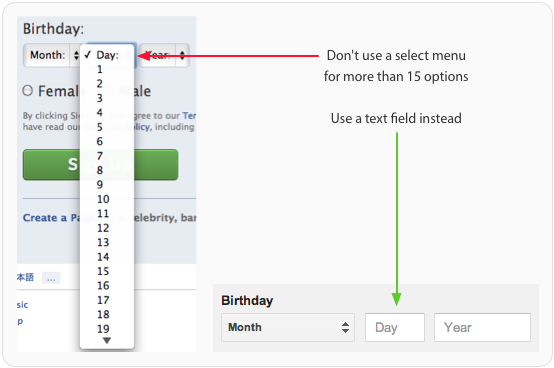
A select menu with over 15 options is just as bad as one with fewer than 5. When you put that many options in one menu, you’ll slow users down because they’ll have to scan and scroll through the long list. Sometimes the list of options can get so long that the menu takes up the entire screen.
When you have more than 15 options in a menu, you should either reduce the number of options or use a text field to allow users to enter their own data. An open text field prevents users from having to fiddle with a long select menu and makes filling out the form faster and easier.
Labeling Select Menus
Like other form elements, a select menu should always have a label next to it. However, you should also have a label inside the select menu that tells users what they’re selecting. The label should clearly and distinctly describe the group of options.
A generic label such as “Please Select” isn’t clear enough for accessibility users who use screen readers to fill out forms. Adding a label outside and inside the select menu allows all users to take action quicker without any confusion.

When to Use a Default Option
Most of the time, you should avoid giving users a default menu option. This is because if users fill out the form and accidentally miss the select menu, the wrong option could get submitted. It’s safer for users to get an error message for not selecting an option than to submit the form with the wrong option.
The only time you should give users a default menu option is when you are certain that over 90% of your users will use that option. This saves the majority of your users time from having to mess with the select menu.

Grouping Options
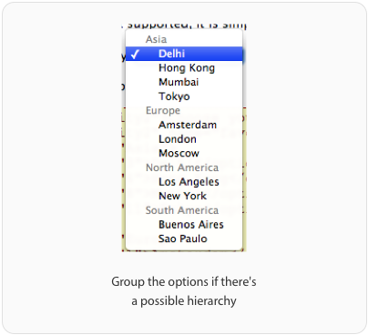
If the options in your select menu have a hierarchy, you should split them into groups using the ‘optgroup’ tag. This allows users to find the option they want quicker by scanning the group labels instead of every single option.
Users won’t be able to select the group labels. They’re only there to give the menu hierarchy and make scanning options easier. Accessibility users also won’t confuse group labels as options because screen readers can’t read them.
Using Select Menus for Navigation
Select menus are mainly used on forms, but sometimes they’re used for navigation. Some websites will use a select menu to allow users to filter or sort page content. When users select an option, it automatically navigates them to a new page. This approach is only accessible to screen readers if users can tab through the options without navigating to a new page.
The select menu should only navigate to a new page when the user hits enter. A small minority of screen reader users will have Javascript turned off. In order for select menus to work with Javascript turned off, you need to have a submit button next to it. This will navigate users to a new page after they select an option and hit the button.

Select Menus Are Best for Forms
Although you’ll see select menus used for navigation, it is recommended that you only use them for forms. Mobile websites will often use a select menu for their main navigation to save space. However, there are problems with this approach that affect usability, accessibility and SEO.
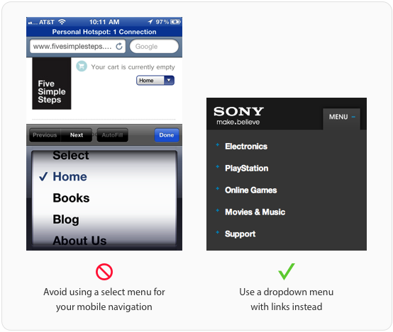
One way it affects usability is that it doesn’t blend with the site design. Mobile form elements have their own default style and can look awkward when you use it for site navigation. It also feels awkward once you click it because you’ll get the spinning wheel for picking options on mobile forms.
Users have to tap the menu, flick their finger to the right option and press the ‘Done’ button, which is a lot of work. Not only that but the ‘Previous’, ‘Next’ and ‘AutoFill’ buttons don’t work because the user is not filling out a form. Screen reader users won’t be able to use your select menu navigation because most will have Javascript turned off.
A more accessible menu is a dropdown that allows users to finger tap or keyboard tab to select an option. This is better because the options in a dropdown are links, whereas options in a select menu are not. Using links as menu options will also give you search engine optimization benefits.
Stop Misusing Select Menus
There are a lot of misused select menus on forms. This happens when designers and developers don’t know how and when to use them. You can help put an end to select menu misuse by making sure your site follows these best practices. You may get everything else right on your form, but one misused select menu can cost you users.
Book

Affiliate

Very informative, thank you.
For 15+ items, a dropdown with a search input built in (that autocompletes when typing) is a great option.
Misuse of motif. Users see a dropdown arrow and assume it’s the same “select box” that they have seen for the last 20 years; many/most will likely not realize they can type to filter.
Saying it like that makes it sound like we’re not allowed to change anything just because of the users who aren’t intelligent enough to realise things have been changed. If you take that kind of attitude the web will stagnate.
Agreed 100%. The other Joe is an idiot. This Joe is not.
You need a balance between innovating your UI and taking advantage of users’ built-in inclinations. Innovation is great, but too many new concepts and it becomes exhausting and un-fun to navigate the site.
Not knowing things have changed does not make a user unintelligent, it just means they aren’t a savvy web user. I have no idea how to operate an airplane (old or new), does that make me unintelligent?
Besides, when you’re in e-commerce, you can’t afford to assume your users are hyper-savvy web users.
The web hasnt improved because it was built for intelligent folk it grew as it made sure that any body can use it.
Nice article.
When you suggest using a text field for menus that have more than 15 options, that works fine when asking people to fill in a form. It doesn’t work when people are using a filter for example, when they don’t know what all 15 options are likely to be. You can’t ask people to guess.
Well, I was thinking of this problem too. Sometimes you have to use select menus with more than 15 options, because users don’t know the options themselves so they can’t type them. In case the users have a rough idea of what the options are I have found myself using auto complete text inputs, which helps to decrease the number of options. But if they have no idea about the options are there any suggestions?
YES I think this gets to the real point here – does the user know the data already, or do they need some help deciding? Users know their birthday, it’s way faster for them to just type it in. Don’t mess with a dropdown when the user already knows what goes in that field (and can easily type it).
And for that matter, it would be more effective for the month of birth to be a text field too, if it weren’t for the *very* big problem of inconsistent date formats.
While I don’t personally use select menus for navigation, I disagree with the assumption of an SEO impact of this technique.
I don’t see why this would be the case unless it was done naively.
The better sites using this select method take the unordered list from the main site (assuming responsive here) and use JavaScript to render that as a select box. Why a select box? Because it integrates perfectly into the phone operating system and can emulate a native application.
Assuming users don’t have JavaScript, it would simply render the UL.
With all that said, I prefer the UL method anyway – I like having control of how the navigation looks.
The SEO impact relates to the crawl-software not being able to “link” to the next page if the only method of reaching that content is via a dropdown/javascript event handler.
Your suggestion of converting the UL to a select based in responsive design wouldn’t impact SEO since the client crawler wouldn’t be filtered as mobile.
> Why a select … native application
Have you seen the different ways different mobile systems implement a Select?
Let me give a rundown:
iOS (1..3ish): disrupts half the screen
iOS(3ish…on): disrupts entire screen.
Android (1.0-2.1): Creates full-screen dropdown (often unstyled)
Android 2.2: Creates full-screen dropdown IF screen size cannot hold longest item. IF can, creates half-screen, attempts to fit as a “select a thing”. Carrier dependent, so this might be completely wrong on a T-Mobile HTC device. It might just crash.
Android 2.3: Similar to 2.2, however will attempt to style to HTMLView styles. Carrier dependent: HTC and others did strange, ugly things to HTMLView and to native device dropdowns (including ignoring them entirely)
3.0: Random. Each device group is different, and May Be Unusable. (There are Honeycomb devices which simply cannot render a list of items > 4 items.)
4.0: Semi-Random: Carrier dependant (again) but attempts to keep the HTMLView over list (looks like GTK dropdown)
4.1+: HTMLView owns the dropdown. Its no longer native, but instead looks closest to the “CSS Spec” (If you’re using Bootstrap or some other) otherwise, attempts to look generic. If can’t fit inside screen area, semi-native (modal, cannot escape! Danger will robinson!)
Blackberry: Let’s not go there.
WP7+: Looks like a Windows 98 dropdown.
The lesson here? the list approach is simply a better option. You as a designer get more work over the style, and you don’t get frustration when someone accidentially punches it and doesn’t WANT to change.
Plus, screen readers get really happen when you wrap it in tags.
Great article. People are always misusing common UI elements when there are better alternatives even if they take a little extra work.
Cubicle Ninjas
http://cubicleninjas.com
**When to Use a Select Menu** — when needed.
**Labeling Select Menus** — every time. It’s a W3C standard.
**When to Use a Default Select Menu Option** — every time. It is not your fault that user is dumb and can’t check fields before submit. And it’s your fault when user HAS to click all the selects just to change it from “Select something”.
**Grouping Select Menu Options** — when needed.
**Using Select Menus for Navigation** — never. It’s retarded.
And basically it’s not developer’s case to decide when to use what. It’s designer’s task. But as we see lately, developers think they can design, and designers think they can skip some parts of design, leaving some work on developers’ shoulders which they obviously suck at.
Very well written, you ping several key points and a number of pet peeves. Totally on-board with everything except Selects as Navigation. We have way too many ways to provide access to additional navigation links without resorting to misusing a form input component. So the heading
“Select Menus are Best for Forms, Not Navigation”
should read
“Select Menus are Only for Forms, Not Navigation”
And not include the section above it.
Thanks for posting, found it on talentopoly.com
Tend to disagree with this a bit. I would never use select menus for PRIMARY navigation, but it certainly can be useful for other types of navigation – like changing filters to navigate a photo gallery, etc…
Filters aren’t navigation. The argument stands.
totally agree,
i reckon every developers should read this, this is just beyond designers, Developers are mainly doing this mistake (POV)
great article,
Yoosuf
great post and very informative, Thanks!!
Use of select in navigation – paging I would say. Many a popular forum where a post has 10s of pages are better with select elements, so you can skip to a page easily. Otherwise you might have to click next a lot (or manually change the URL).
Otherwise a great article.
Great example to create great UI. Thank for the post.
Great article, when have more than 15 options I still use select menu but will use it with chosen Jquery 🙂
That’s great evaluation on Human Computer Interaction, thank you
I would also add a autocomplete on the input forms, as an alternative for the drop-downs with 15+ items.
Excellent post. I have used select menus for navigation for smaller screens in my responsive templates. I won’t now!
There are some use cases for a list of options where having a Select box lead to increased usability.
For instance, as mentioned in one of your firsts examples, the gender select box, an user could simply type the letter ‘M’ to have it filled instantly.
I personally hate breaking keyboard typing flow to use a mouse, while filling a form.
I’d like to see some user research results to be convinced.
What radios are missing, is a way to return to the null state (well, you can easily build it). That’s why select box are used more often, because it’s easier to return to the null state: just add an empty option!
“When you have more than 15 options in a menu, you should either lessen the amount of options, or use a text field to allow users to enter their own data. An open text field prevents users from having to fiddle with a giant select menu and makes filling out the form faster and easier.”
Proof? In usability I see people get tripped up by open input fields way more than by select lists.
Input fields can especially be a nightmare on mobile, where typing and positioning a cursor is difficult. And on desktop input fields require both hands to fill out (one on mouse, one on keyboard). And if there is a default value in the field, there’s additional mouse dexterity or key taps required to place the cursor before or after that value. And an extra tap to delete that value.
Also, if you’re using input fields, usually an extra click is required to commit that value (if customer don’t hit the enter key, for which there’s usually no affordance). If you’re using a select list, you can commit onChange. (I know that there are non-JS-enabled people out there, but my analytics tell me that’s a vanishingly small number.)
Furthermore, if the values customers are selecting from are predictable (say you’re running an ecommerce site, and 99% of the time, users change item quantity from 1 to 2, and about .01% of the time from 1 to 20), then you can easily justify a select list – especially in mobile where the values are predictably ordered in the select list.
This is not to say that we should have a 100 values in select list. Rather it’s to challenge the assertion that input fields are better. I’d argue that custom controls (increment/decrement buttons, combo boxes, date pickers etc.) can easily trump both.
For lots of entries a select menu is fine but it has to be fuzzy text searchable. Try chosen or select2 query pligins
Depends also I guess on how you control the number of options. If the field is populated dynamically are u suggesting to change the type of field depending on when the option count gets too high…that could be more confusing.
Good piece, and I think I agree with most of it.
One use case where I can’t think of another option but a select menu with > 15 items; a state/country selector. Even for states, if you simply provide a text box then it’s remarkable how many people mistype a two letter abbreviation…which can cause service issues later down the line.
For more than 15 entries I recommend jquery.chosen
Thanks for the great article.
great tips! thanks for showing me how much I misuse the select control lol
I’m looking forward to browsers and screen readers fully supporting the datalist. This allows us to easily create the autocomplete experience by giving the user a text input and providing a list of possible solutions. The list will be narrowed as the user types.
Intro to datalist: http://webdesign.tutsplus.com/tutorials/htmlcss-tutorials/introducing-the-html5-datalist-element/
This is a good replacement for many of the expansive select menus.
Great article! Good points! One thing I’d like to emphasize though (not having read through responses this may already have been pointedout), the percentage of screen reader users who turn their Javascript off is about the same, or even less, than that of the general population. So the no Javascript argument being particularly harmful for users of screen readers is not entirely accurate. Apart from that, great article, just what I was looking for for an accessibility evaluation case I am discussing with a group of web devs.
I have gone through many forms in websites and sometimes I find select menu, which contains hundreds of options. The problem I faced there is that some sites do not allow me to move through menu using my keyboard. So I have to use the mouse, which is very time-consuming and irritating for me. I think select menus should support keyboard usage also, so that user can easily move through the menu. It will be more user friendly in this way.
Can you write a new post called, “stop misusing ‘less’ when you should be saying ‘fewer'”? =P just giving you a hard time. But where you say things like “less option buttons”, you should be saying, “fewer option buttons”.
Interesting article, thank you.
However, I have a question that I would like others to help me out with. What if my choices are dynamic? I mean, client gives me 2 options now, but says that more may come in future as the system evolves. So, is there a place for exception here where I would use select menu even for 2 options with the idea that more may come, or is it that I need to make it radio at first and force users to re-learn the control when changing it to select in future?
On this “Sometimes the list of options can get so lengthy that the menu takes up the entire screen. When you have more than 15 options in a menu, you should either lessen the amount of options, or use a text field to allow users to enter their own data.”
Sometimes this isn’t an option. I’m working on an application that allows users to view a graph with different lab test results. The user wouldn’t know what lab test to type in, they would need a list to choose from, and the list could be long, depending on how sick they are and how many tests they have had. We don’t have room in the UI to just show a nav of some sort that displays all.
From a developer’s viewpoint, the select list eliminates ‘magic strings’. Hooray for the select list!
Re the birthday example I would like to comment:
As a general rule, I try to make interaction prevent invalid inputs rather than verify and report invalid entries. The select menu (with its drawbacks) does allow for invalid numbers for the day.
In the birthday case, I would suspect even the most basic user to be able to enter a valid date, so the argument for prevention is weaker.
And BTW, a date picker would in this case let you have your cake (simple interaction) and eat it too (prevent errors rather than validate).
I would love to see an update to this regarding how field format choices specifically affect mobile usability/UX especially in light of the new thoughts on how hiding options causes abandonment.
I don’t agree with the radio buttons in place of select/dropdowns in a couple of instances:
1) if the user can validly select neither option radio buttons do not offer a way to unselect once you’ve selected one.
2) on touch devices radio buttons usually offer a poor touch target, adding additional to counter this issue can often lead to more space being used than would have been required for a select/dropdown.
3) if your form has dropdowns for other fields where it is the most appropriate control then sometimes it’s simpler to keep the consistent controls throughout, textboxes and dropdowns, rather than introducing a variety of controls that users may be unfamiliar with.
My thoughts may be influenced by having to develop website and apps for users with limited IT skills.