Are you presenting your content the way users read it? An eye-tracking study found that most users don’t read entire headlines. Instead, they scan the left side and only read the first few words. They do this because they’re searching for keywords to see if the content is worth clicking.
Users Need Keywords Fast
If the first few words in your headline don’t hint at what the content is about, users will likely skip it. When they hunt for information, their patience and attention span is short. There’s a lot of content on their screen, and they don’t want to waste time. They need to see relevant keywords quickly, and the best way to do this is to use eyebrow text.
Eyebrow text is a descriptive keyword or phrase placed above the main headline and blurb. It appears in a smaller font and sums up the content in just a few words. When users scan the headline, they’ll also scan the eyebrow. As a result, they’ll better understand the context, which increases the chance of them reading the blurb and clicking through.

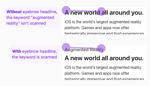
In the example below, the content is about augmented reality. However, the headline doesn’t convey this at all. It’s only in the blurb that users see the keyword. Many have already skipped the content entirely because the headline didn’t provide enough context.
In contrast, when the keyword “Augmented Reality” is used as an eyebrow, users can immediately scan the keyword. They get the context of the content quicker, which gives them an incentive to click. Instead of scanning a paragraph to get the context, they only need to scan a couple of words.

Eyebrow Styling
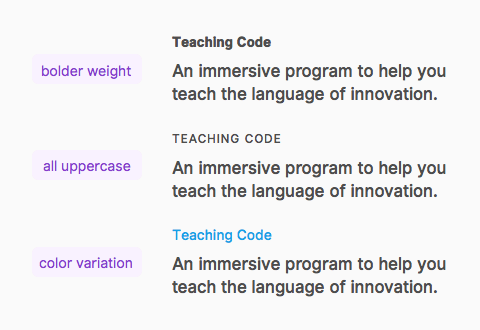
Your eyebrow heading should be smaller than the main headline but still easy to spot. You can make it distinct by varying its visual style. Some ways to do this are to add a bolder weight on it, all uppercase the letters, or change its color.

When to Use Them
Not every headline needs an eyebrow. It’s redundant to add an eyebrow if your headline is short and contains many keywords. Remember users will scan the first two words. If your first two words already have keywords, an eyebrow would only distract users. They’re most useful for long headlines that don’t contain keywords.

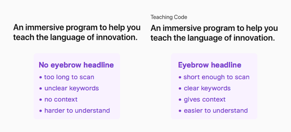
In the example above, the headline without the eyebrow is harder to understand because the context isn’t presented upfront. Users need to read the entire headline, which increases their cognitive load. But the headline with the eyebrow allows them to get the context first before they even read the headline, so they can decide whether the rest is relevant or not. This not only saves them time, but it makes the content easier to understand.
Users Need Context
Users don’t have the time and energy to read every text on your page. Present your keywords upfront in an eyebrow text to give them the context they need to click. Without it, users may never get a chance to know what you’re all about.


Interesting info. Using eyebrow text seems like a beneficial way to hint exactly to the main subject of the article without having to clutter the headline. I’ll keep this in mind. Thanks for sharing.
To me, simply including the category label(s) of the post as the “eyebrow text”, as this very site does, seems like the most reasonable, scalable and elegant application of this research.
Great food for thought, I’ll definitely be testing out the use of eyebrow text especially on emails to see if they can help improve CTR. Thanks Anthony!