Have you ever been to a website and couldn’t find what you were looking for? Most websites today overwhelm users with content irrelevant to what they’re looking for. Users end up getting lost and distracted, spending extra time looking for the content they wanted. This happens because too many websites promote content discovery without considering content findability. It’s good for users to discover new content, but not at the sacrifice of being able to find the content they want.
Web Pages are Like Grocery Stores
Browsing a web page is like walking into a grocery store and looking at all the products. You might see some products with hot deals at the front of store, but soon after that you’re off to the aisles looking for what you came to the store to get. Users that visit websites do the same thing. In order for the store customer to find what they’re looking for quickly, they need to know which aisle to go to. They do this by scanning the aisle signs. However, not all stores with aisle signs have high findability.
Aisle signs with low findability
Aisle signs with low findability generally look the same. Even though each aisle is properly labeled, the signs are not distinct, which makes it hard customers to scan and find what they’re looking for. The lack of distinction forces users have to read each aisle sign. This uses up the customer’s time and energy and makes finding a specific product harder.
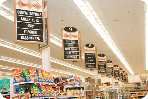
Aisle signs with high findability

Aisle signs with high findability are individually distinct. Customers can scan the aisle signs and quickly find the product they’re looking for. What makes the signs visually distinct and easy to scan are the color coding, pictographic icons, large label font and a general single word label representing all the products on that aisle.
Aisle Signs are Like Page Headings
If web pages are like stores, then aisle signs are like page headings. To increase the content findability of your web pages, you have to make your page headings more distinct. Apply the same design principles used on the high findability aisle signs to your page headings.
Label content using general, single-word headings

Sometimes it’s hard to find a single word to describe your content, but it’s possible if it’s organized in a simple way. A single word is shorter and faster for users to process at a glance. A general word maps to how most users would describe the content they’re looking for.
Use a large font for page headings
![]()
Small page headings are hard to scan and spot especially when they aren’t larger than the size of the body text. Make your page headings large so that it stands out from all the other text surrounding it. Choosing a nice typeface can also help make it more distinct. Aisle signs are easy to spot because the font on them is large.
Display a pictographic icon next to headings

Words aren’t always enough to make your page headings distinct. Displaying a pictographic icon next to your headings can allow users to find content faster because the visuals give them a strong emotional connection with the word. When they see the visual, they’ll think of the content related to it.
Align headings together for easy eye movement

Where you place your page headings can affect content findability. Avoid scattering them around the page in random places. Instead, align them horizontally or vertically with each other. This allows the users eyes to easily scan and visually fixate on each heading without moving their eyes in random directions.
Color code different content

Using color to distinguish different content not only helps findability, but also allows users to easily recognize where certain content is when they come back to your site. Color also elicits different feelings in users, which allows you to match those feelings with content for a stronger connection.
Distinct Headings Increase Findability
If your users are having trouble finding content on your website, increase the content findability of your web pages. Make your page headings visually distinct and you’ll notice a difference in how fast users find what they’re looking for. In the real world, signs give people information from a positional distance. On the web, page headings give people information from a page distance. The more distinct you make either of them, the faster it is for people to find information.
Book

Affiliate

Good points. I am authoring a training module on how to optimize Web content for better findability, but my focus was on making content more findable through search and navigation (i.e., making content better for indexing). You have helped me see I was missing a very important aspect: finding content within the page itself. Thanks!
I love the grocery store analogy – I use it also to explain the need for good labeling and organizing and “you might also like” considerations. Grocery stores like your “low findability” example give me “tired head,” especially when I am urgently trying to find a product.
Great tips, Anthony. I’ll be revaluing some of these on my current projects, perhaps there is room for improvement.
Great illustration using supermarket aisles. But I did not experience your coloring of headings well. Plus it has accessibility issues: the colorblind, or those printing on a mono printer, will not benefit from your color scheme, so you had better make sure it is not a primary means of showing distinctness or relatedness. Proximity, aligment, icons and font are all better than color for this purpose.